Backstory
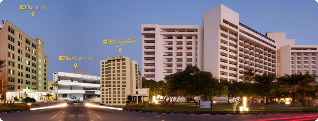
An online travel booking platform that was recently founded in Nigeria, now serving global travelers. The platform allows users to easily book hotels, short-let apartments, and car rentals for trips around the world.
BookingCorps
Travel & Hospitality
2024

The Situation
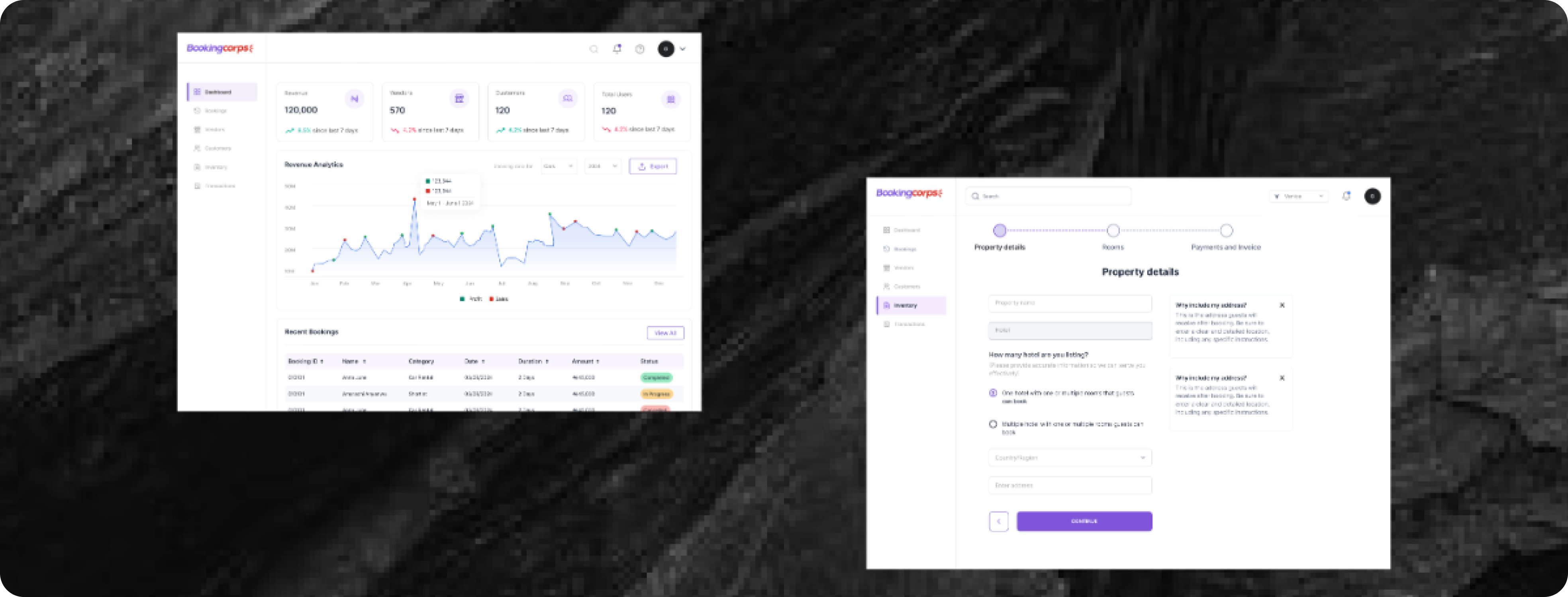
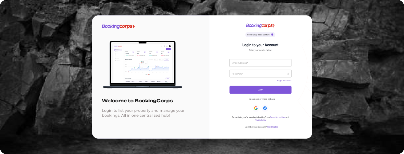
BookingCorps initially focused on a user-facing platform for hotel, apartment, and car rental bookings. Recognizing the need for a comprehensive system, we expanded to include accommodation providers to list their properties and administrators to manage the operations. The tackles;
User Experience
BookingCorps line of action involved providing a platform where accommodation providers can successfully
list their properties for guests passing our quality assurance and compliance process. This feature was
designed to cater exclusively to property owners.
As we proceeded, the initial decision was to have just accommodation providers list their properties.
Recognizing a management barrier within the platform, we sought an immediate solution.
In a meeting with the product team and stakeholders, we did a brainstorming session to explore
implementing
admin module on the platform. Evidently, this implementation aimed at creating a unified and centralized
hub
for the guests, accommodation providers streamlining operations and enhances the overall user
experience.
Research
As we delved into the projects requirements, my NOW focus centered on gaining comprehensive
understanding of
BookingCorps platform. We proceeded to conducting in-depth research into the operational workflows of
both
accommodation providers and guests. I also explored how each party interacted with the platform, noting
pain points, goals, and how they navigated the user interface.
Leveraging on data insights, it became evident that the lack of a centralized management system was
hindering efficiency. Hosts struggled to manage multiple listings, while guests faced inconsistencies in
the
availability and quality of listed accommodations. Addressing these challenges, I conducted a
competitive
analysis, assessing how other booking platforms manage host and guest interactions, alongside performed
usability testing to observe how providers and users interacted with the current system.
Next, our Product team set up digital working sessions with the stakeholders, to discuss added features
(if
any) design, as well as any engineering limitations. Having no insights into what our product looked
like, I
did a sketch identifying the necessities for the centralized dashboard.
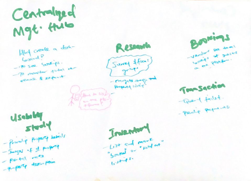
A SKETCH REPRESENTATION OF THE ADMIN MODULE DURING A MEETING
The Solution
Transitioning from sketching to creating our screens, introducing visual elements constantly refining
designs based on valuable input from our team and stakeholders. Throughout the project lifecycle, I
collaborated closely with the product, engineering, and business teams, from the proof of concept to
rigorous QA testing. This process helped uncover both customer and business needs, ensuring a
highquality
product build and a successful launch.
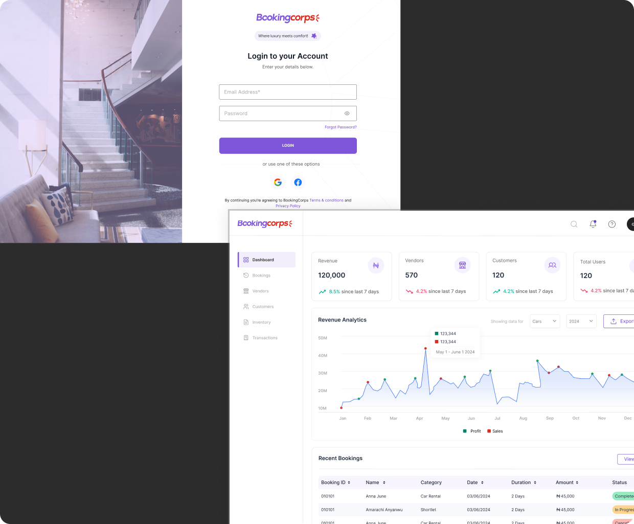
Successfully, the “List Property” feature was implemented, enabling accommodation providers list their
properties seamlessly and manage guests and bookings.
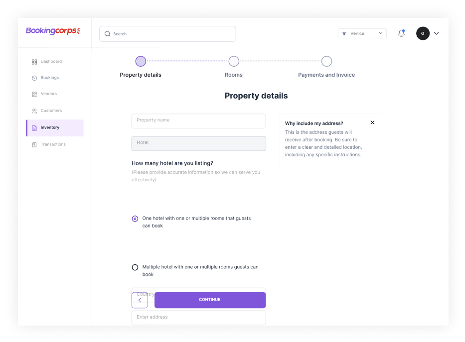
The calendar sync feature allows property owners to synchronize their availability ensuring that listings are always up to date, reducing the risk of double bookings and improving the overall management of property schedules.
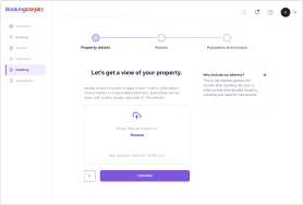
Upload and showcase high-quality images of their listings. This will provide prospective guests with a clear understanding of the property, also supports multiple image formats and allows easy editing and updates.
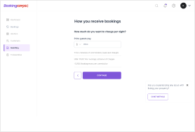
This feature allows the audience synchronize their availability ensuring that listings are always up to date, improving the overall management of property schedules.
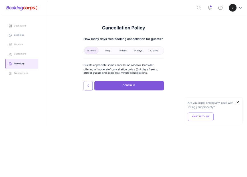
Enables property managers to set and manage cancellation policies tailored to their needs, ensuring transparency by outlining conditions for refunds, penalties, or changes when reservations are canceled.
Design System
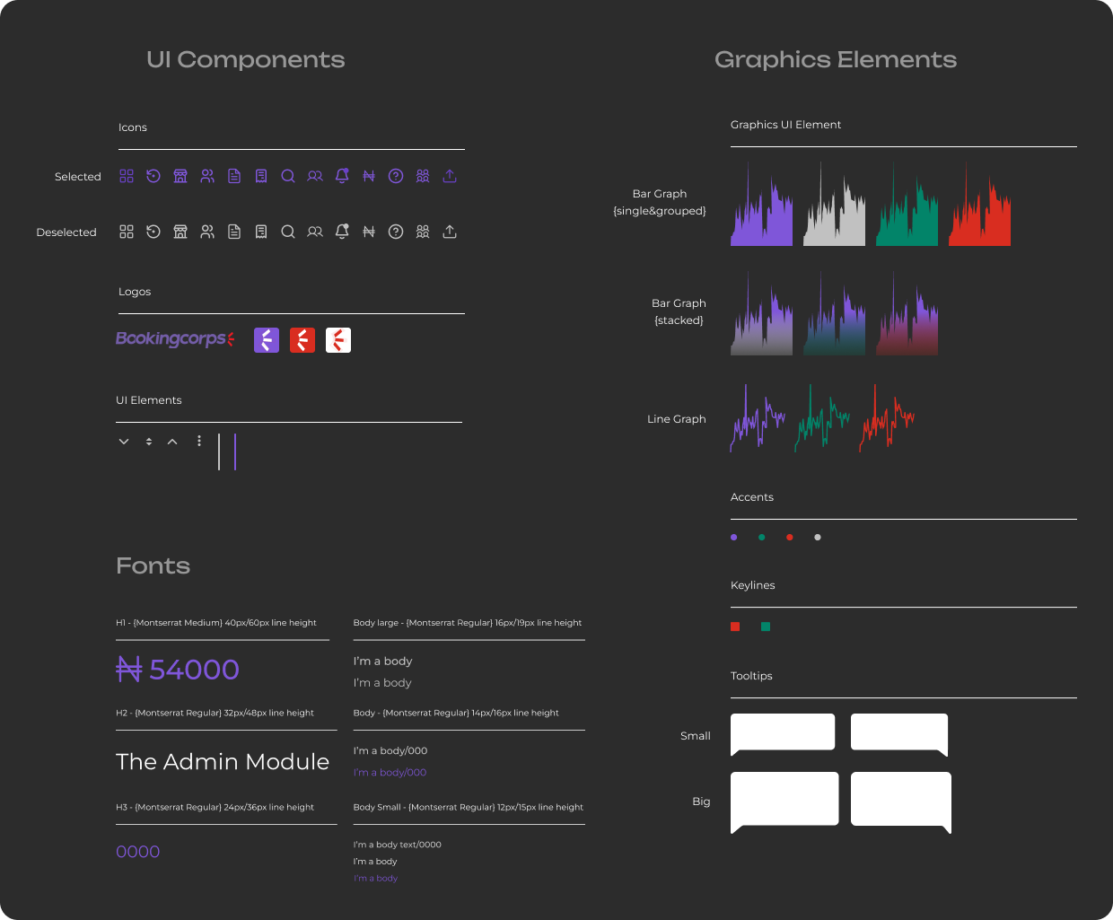
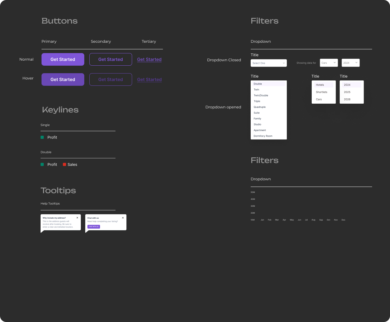
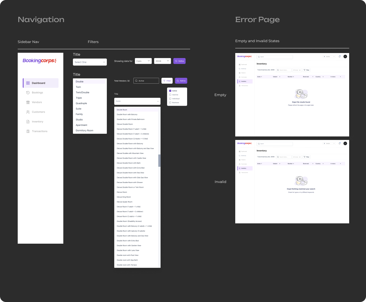
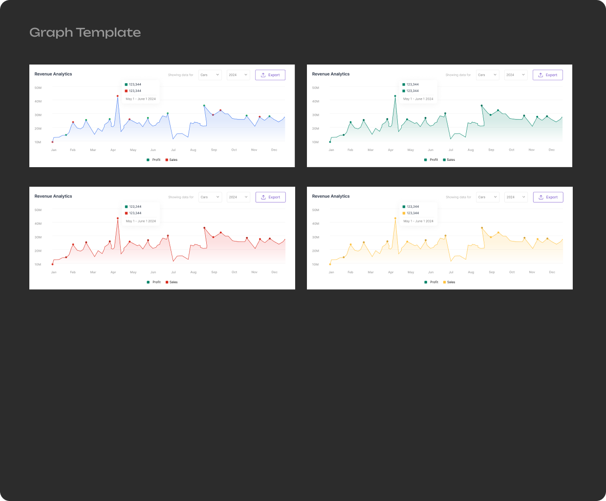
Using the atomic design methodology in my approach to the project, I broke down the complex user
interface
into smaller, reusable components. Starting with the most basic elements (atoms), I was able to design
and
organize them systematically into larger components like molecules, organisms, templates, and eventually
full pages. This method ensured consistency across the platform, made the design scalable, and
facilitated
efficient iterations, ultimately improving the overall user experience and design cohesion.
Also adaptable to different devices, ensuring usability and consistency across all screen sizes. I
implemented flexible grids and defined breakpoints to create a responsive design that adjusts seamlessly
to
various devices, from mobile phones to desktops. Throughout the process, I worked closely with the
developers, explaining the rationale behind the grid system and breakpoints, constantly monitoring the
development progress, providing continuous feedback, and ensured that the final product met both design
and
functional requirements.
Web Experiments
We carried out testing with 8 accommodation providers (4 persons per group), on how they interacted
with
the “New Listing” feature by creating specific tasks for them to complete within the system. During the
testing, our team closely monitored user interactions and behaviours with each version of the feature,
encouraging users to “Think aloud” verbalize their thoughts while interacting with the system helped us
uncover confusion or frustration through the observation.
Our focus was on how smoothly accommodation providers could navigate the feature, add property details,
and
complete listings. By doing this, we were able to identify the optimal version, ensuring that the design
provided both a seamless user experience and improved business outcomes.
Web Experiments
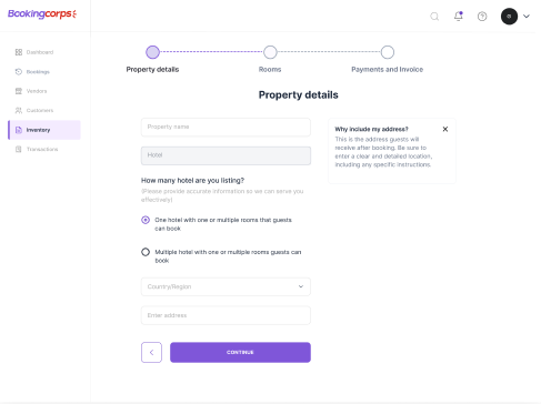
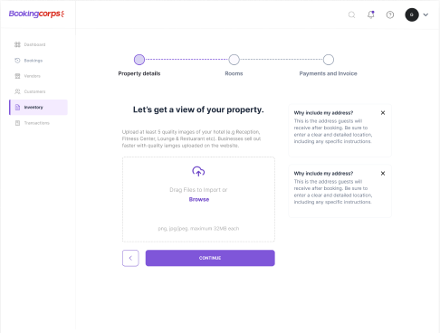
To identify the most efficient structure for users to input listing information and ensure an optimal
experience, both groups independently compared single-step and multi-step layouts.
During testing, we observed a 50-50 split in user preferences between multi-steps and single-step
layouts.
This led us to conclude that users preferred a more streamlined process. Integrating multiple steps into
a
single form where the information fits provides a more efficient experience.
Web Experiments
To optimize user engagement and understand behavior, we conducted an A/B test comparing the action-oriented 'Create Listing' with the descriptive 'New Listing.' The results showed higher user interaction with 'Create Listing,' leading us to adopt it to enhance the experience and drive action more effectively.
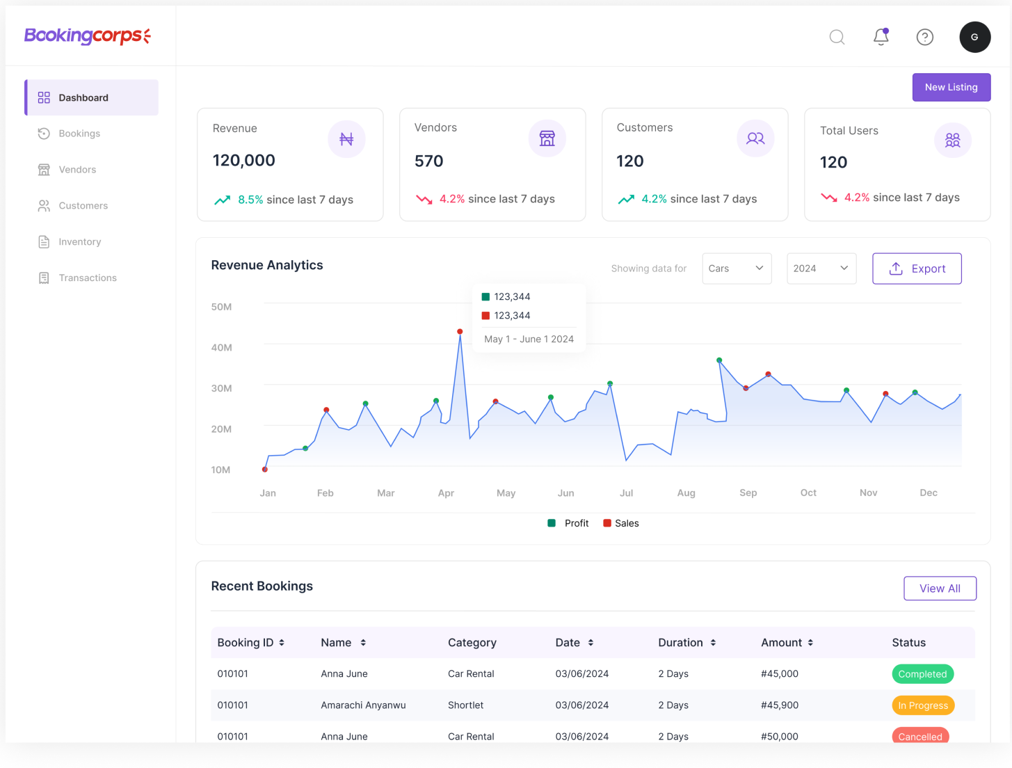
This focuses on highlighting the availability of an action without directly prompting action. While clear in its intent, this version was less effective in user interaction, the label didn’t encourage immediate action, leading to lower engagment during the A/B test.
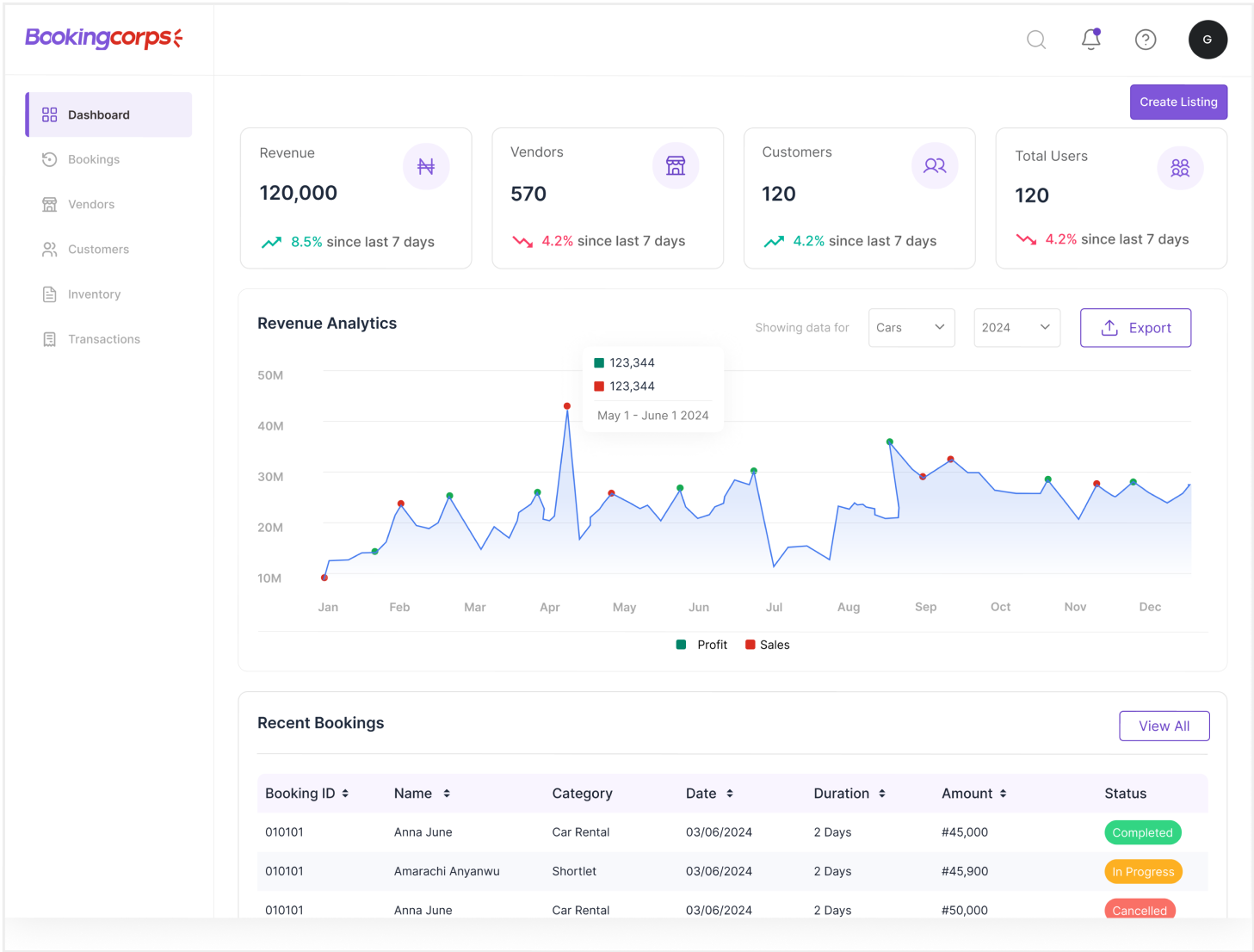
Uses a verb, making it action-oriented and directly encouraging users to engage. This label prompts users to take an active step in the process of adding a listing. The action-driven language led to higher engagement and interaction during the test, and became the final choice to enhance UX.
Conversion
BookingCorps "Create Listing" model is based on accommodation providers, making listing and conversion a critical component of our overall platform design. Recognizing that accommodation providers can easily become "inactive" after listing their property, we implemented a dashboard with real-time data, allowing providers to track booking trends, and encouraging continuous involvement by offering actionable recommendations to improve visibility and performance.
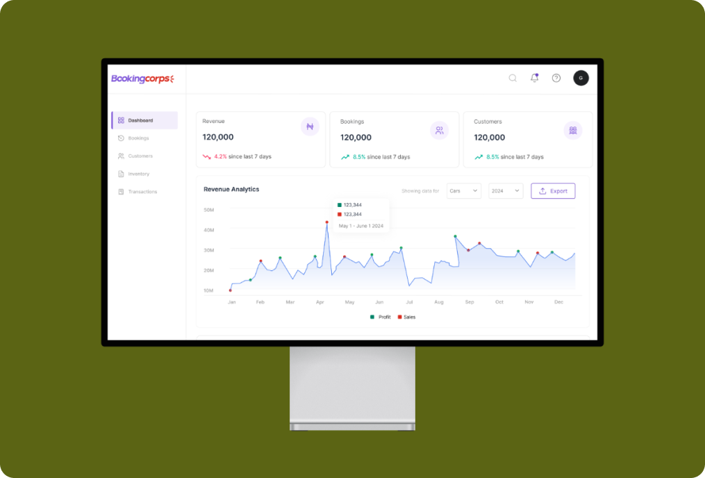
This project demonstrated significant success with over 250+ active listings and a 28% increase in booking rate from guests. This achievement reflects the platform's strength to attract and keep accommodation providers, as well as deliver a seamless booking experience for users.