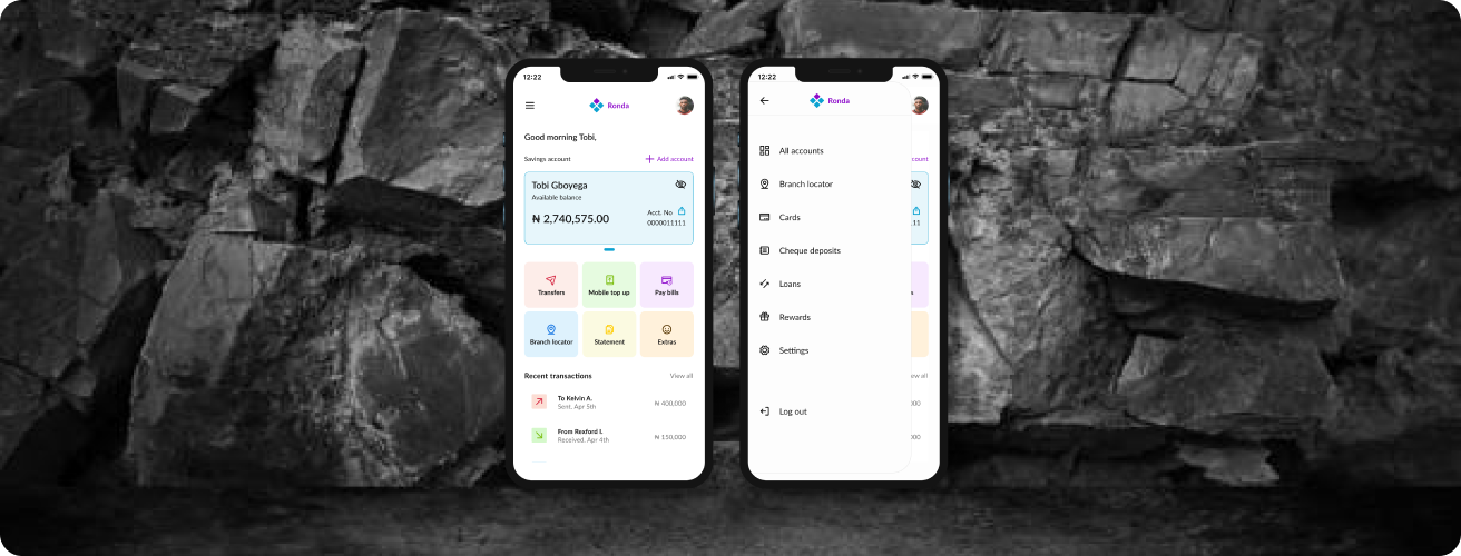
A New Era
This product improves banking in Nigeria, by allowing customers to deposit checks and access virtual cards without visiting a physical bank outlet.
Ronda
Financial Services
2021


The Goal
This collaboration on Design Pal with friends aims to explore innovative ways to enhance the cheque and virtual card banking systems, making online transactions smoother and more efficient for users. Our primary focus is on creating solutions that cater to the needs of bank customers and business owners, ensuring a swift and seamless online banking experience.
Bank users are 60% likely to report inconvenience before cashing out a cheque in Nigeria.
40% likely to report failed transactions when making online payment.
122.2M people in Nigeria use the Bank

Research
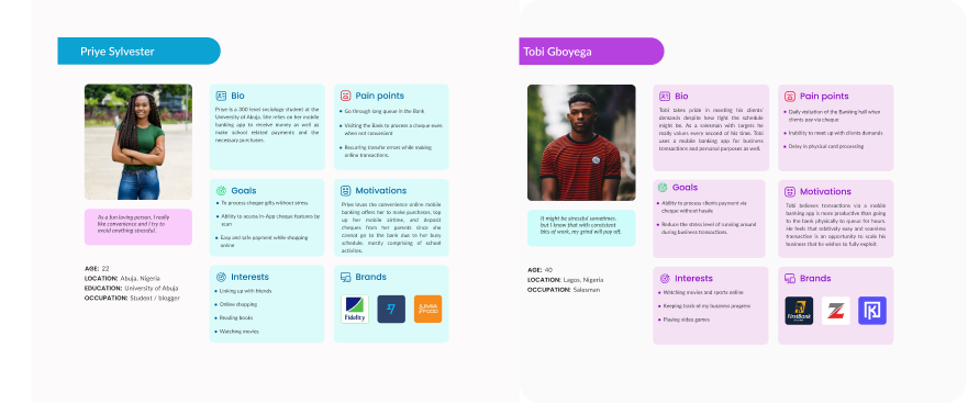
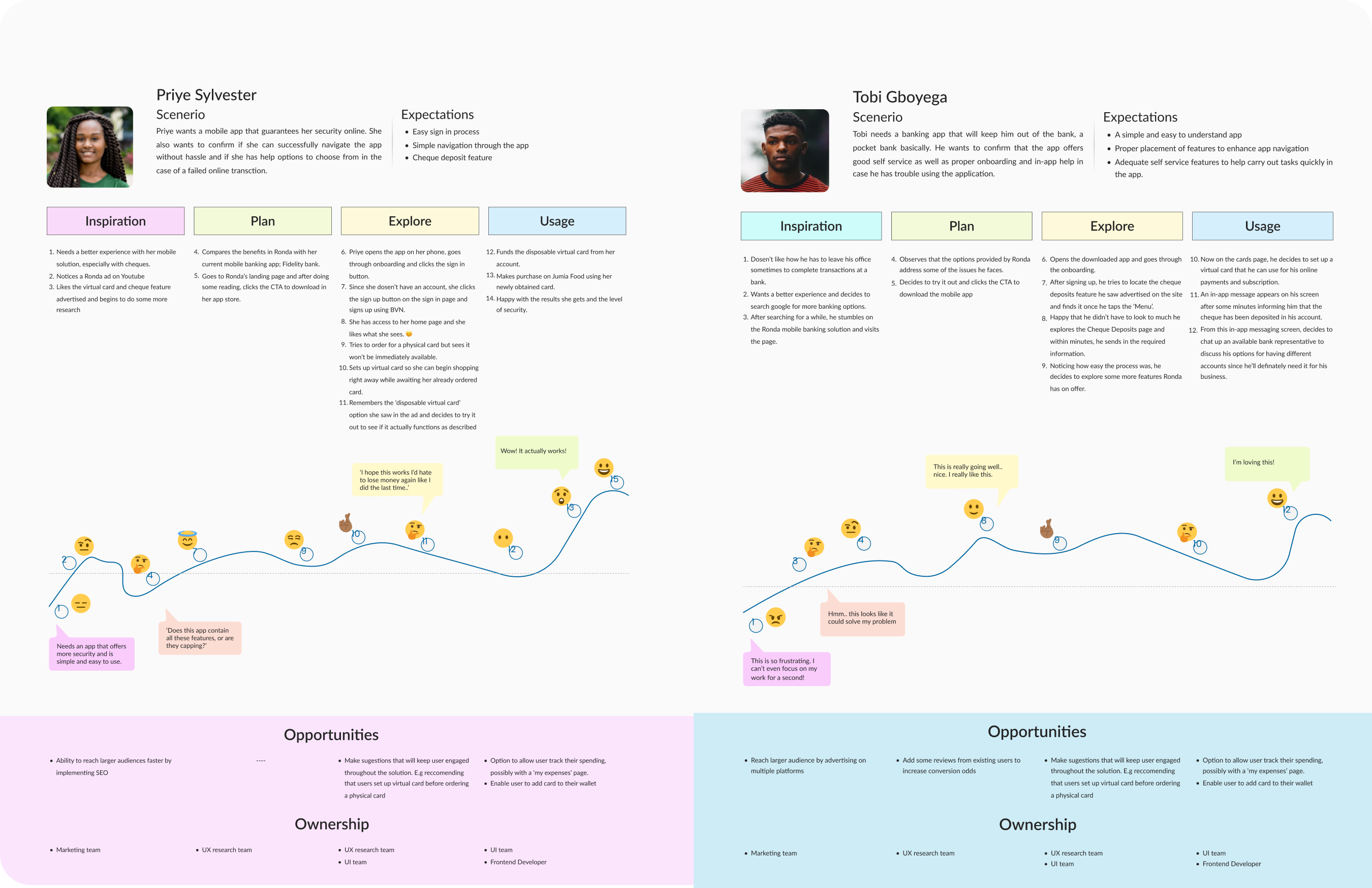
We carried out qualitative research which included one on one interviews and focus groups. Our aim was to have the interviewees answer open ended questions based on their motivations, pain points, goals and their previous experience; especially with the type of solution we were aiming to create so as to know what will work best for them.
...how often do you get Cheques?
...what is the resisting factor to cash out Cheques immediately?
...how often do you need a disposable virtual card during online transactions?
...what challenges do you face before you cash out Cheques?
In-App feature to cash out cheques.
Visiting the bank always to process transactions.
Long queue to process a cheque deposit.
Extra layer of security for online payments.
Eco-sphere
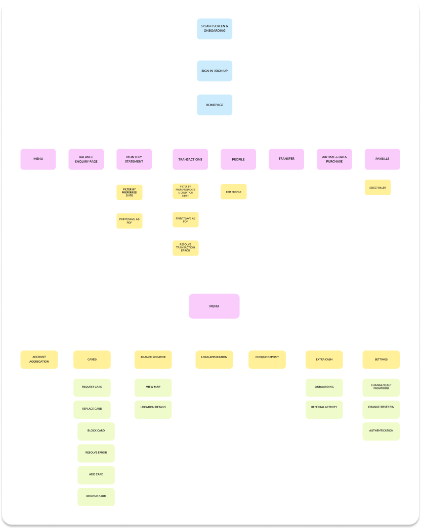
Ronda enables bank users to complete swift and seamless transactions without the need to visit a banking
hall. It focuses on providing convenient virtual card services and easy cheque deposit options.
Additionally, Ronda helps users achieve their financial goals by enhancing their overall banking
experience.

Differentiation
In order to create a truly innovative and user-centric banking solution, it was essential to conduct a thorough analysis of the current market offerings. By examining the weaknesses of leading banks in the industry, we were able to identify key opportunities for our app.

Only offer walk-Ins to deposit cheques

Does not offer virtual cards for swift online transactions

No cheque deposit feature/ virtual card.
Visual Guide
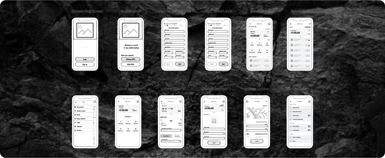
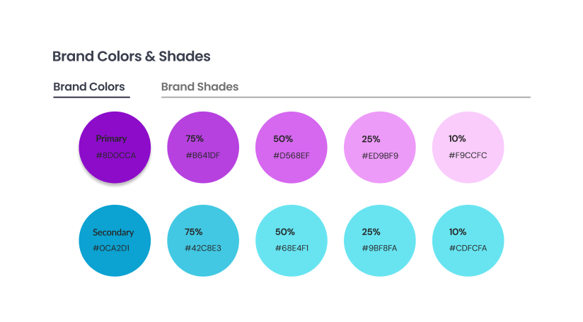
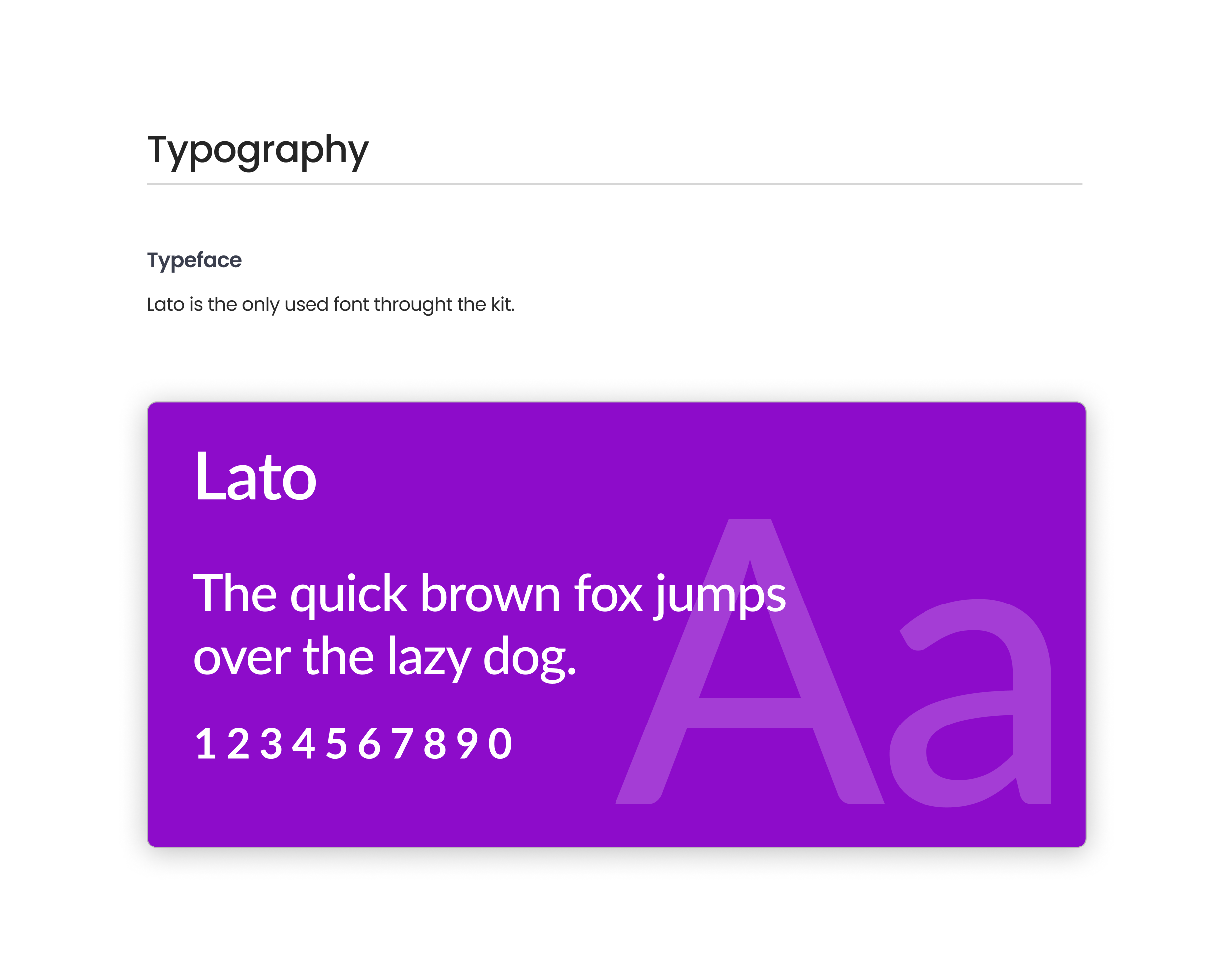
Of course! our next priority was to seamlessly integrate the updated visual identity. To align with the aesthetics, we developed prototypes in Figma to outline the desired interactions and animations, created a detailed design system set with all of the colors and elements and states used in the design.

iterations - Type a
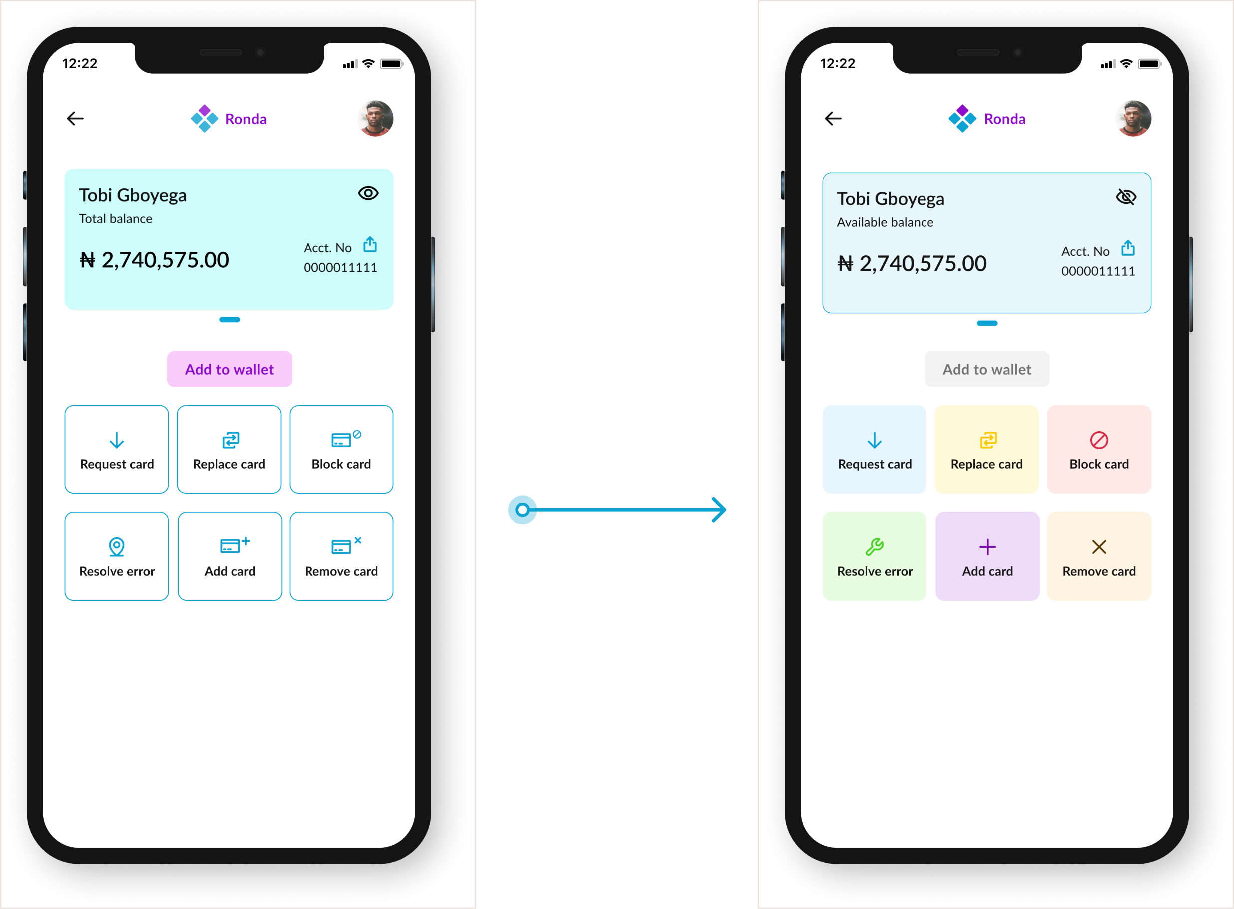
Visual components like color, strokes and shadows can help point the user to the necessary points in the app that they can click to carry out specific actions. As opposed to the six monochromatic cards which might not signify any clear path and even confuse the user in the process, the card menu options is color coded to represent different pathways that the user can take while trying to navigate the card options.
How we prioritized accessibility and consistency
Design decisions based on important principles like consistency and accessibility were considered and appropriate changes were made where it was required.
With insight from a developers’ perspective, we were also able to identify paths in our design that were not feasible and then, make adjustments accordingly.
Visual components were appropriately adjusted to ensure users understand the different paths they can take while navigating the solution.
Lesson Learned
One important feature of human lives is the ability to do work, earn money, and depending on their choice, spend the accrued funds or save them for later and banks will continue to play a paramount functional role to the smooth running of this process. In order to carry out this task effectively, they have to provide an enriching experience for the user to achieve their goals with little to no obstacles. If given primary focus, these important points can help produce these results:
A simplified interface with a proper navigation pattern. This involves considering alternate paths a user can take while exploring the solution.
Provision of adequate support and help when needed to assist users while interacting with the solution.
Implementing design decisions based on the conducted research and ensuring that as much as possible, each aspect of the solution is cross-checked and validated by appropriate research.