
Elevating Productivity
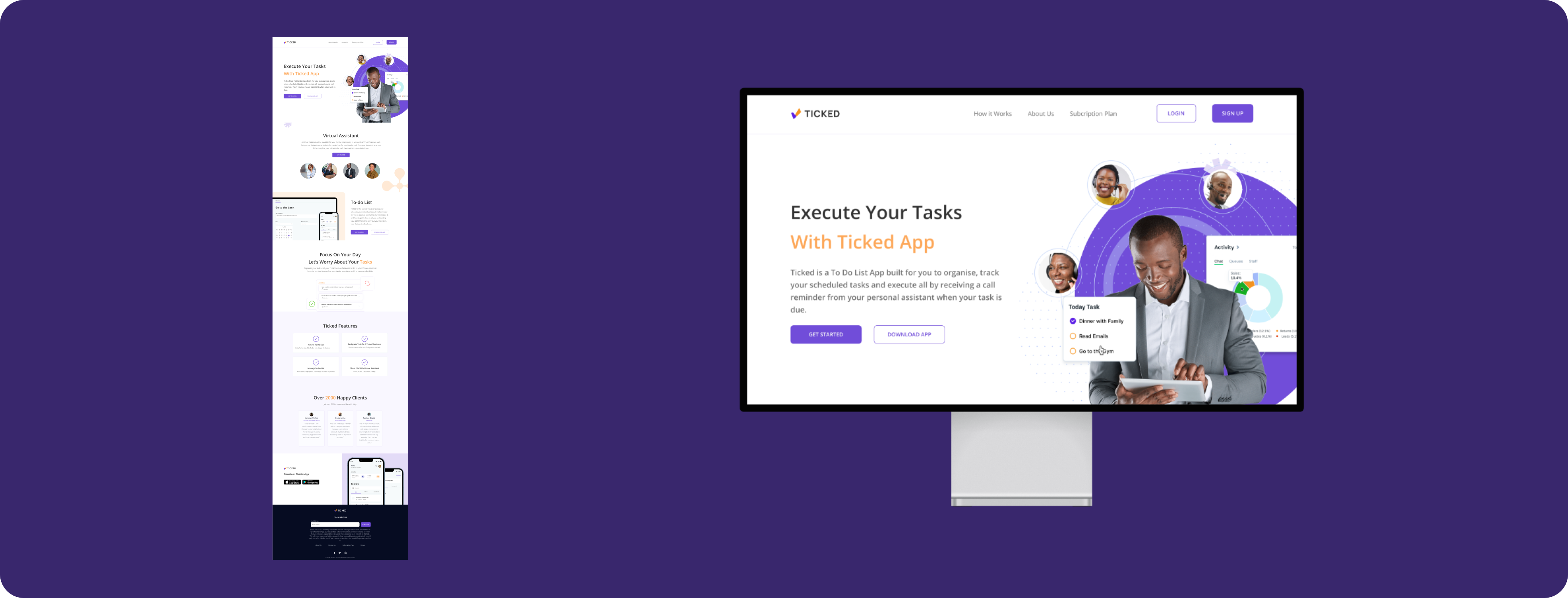
Introducing Ticked, a to-do list app that integrates with a virtual assistant! Create tasks and have an AI complete them freeing up your time.
Ticked
Virtual Assistant
2022

Overview
Basic to-do lists make it hard to prioritize, delegate, and collaborate on tasks, leading to overwhelm and reduced productivity. They often lack guidance, support, progress tracking, and accountability, leaving users to manage everything on their own.
Target Audience
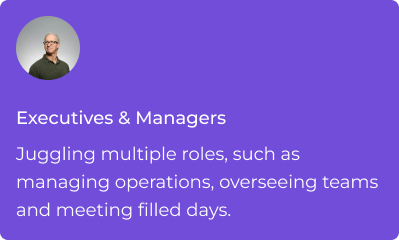
Certainly, anyone can use the Ticked app. However, we included specific features to enhance monetization. By tailoring the app to meet particular user needs, we aim to improve user satisfaction and create opportunities for premium features and subscriptions, supporting our business goals.

solutions
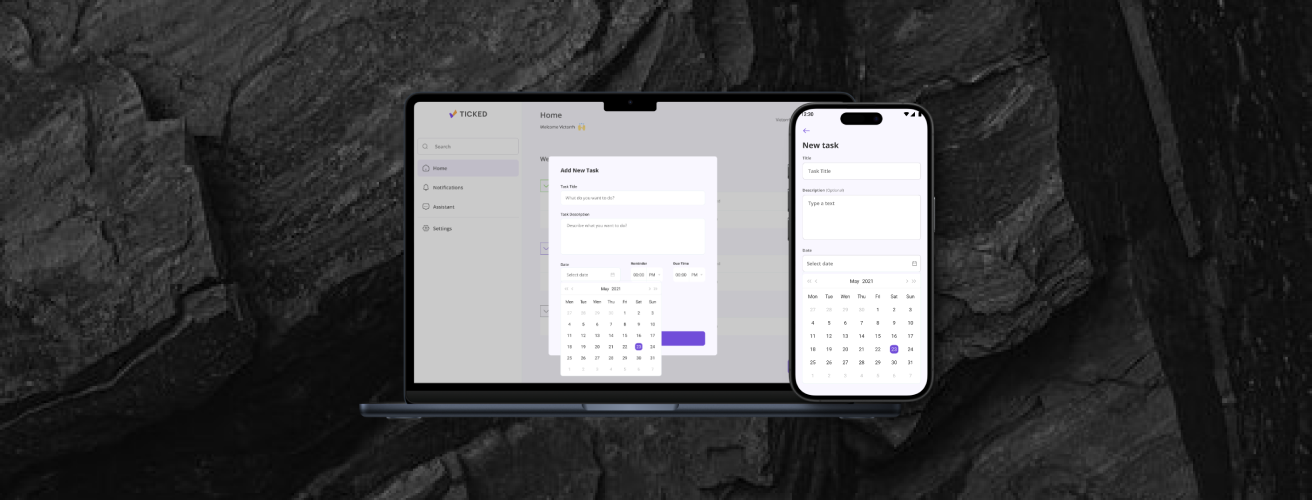
Introducing a context-aware prioritization and reminder system that takes the guesswork out of task management by combining 3 different offerings smart calendar integration.

Your tasks and calendar becomes one! This integrated system analyzes appointments, deadlines, and recurring tasks to surface high-priority items for a streamlined workflow.
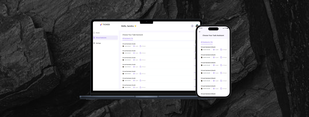
Choose the right VA for each task by accessing their profiles, skill sets, years of experience. This allows you to select the most qualified assistant, ensuring tasks are handled efficiently and effectively.
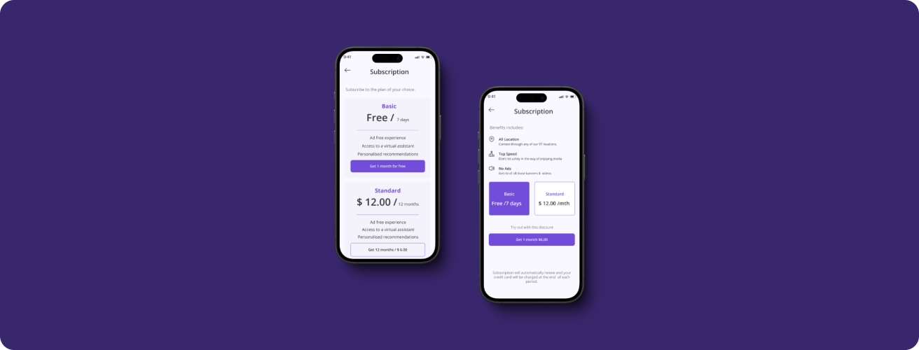
Pricing
At Ticked, we understand that productivity looks different for everyone. That's why our pricing plans are designed to be flexible, offering the features you need to stay organized and efficient, no matter your workflow as an individual user looking to manage personal tasks or a team in need of advanced collaboration tools, we have a plan tailored for you.
We crafted a strategic plan to complete improved architecture by mapping out the user journey, and
delivering site specifications along with a recommended site map.
The challenge surrounded the balance between having the platform as a free resource and also
communicating
the key product offering. From a long-term business perspective, we identified which user group best
suits
overall product revenue goals in order to begin prioritising them and their journey in the overall site
structure.
USER TESTING
Here is one key takeaway that we got from our user testing on the low-fi wireframes:
Since it is a To-do list app that help users complete a task, there should be a “motivational quote” that encourages the user upon arriving at the homepage before creating a task

One of the key lessons I learned during this project was the huge role of user testing. The testing phase highlighted the importance of understanding user behavior and needs early in the design process.