Backstory
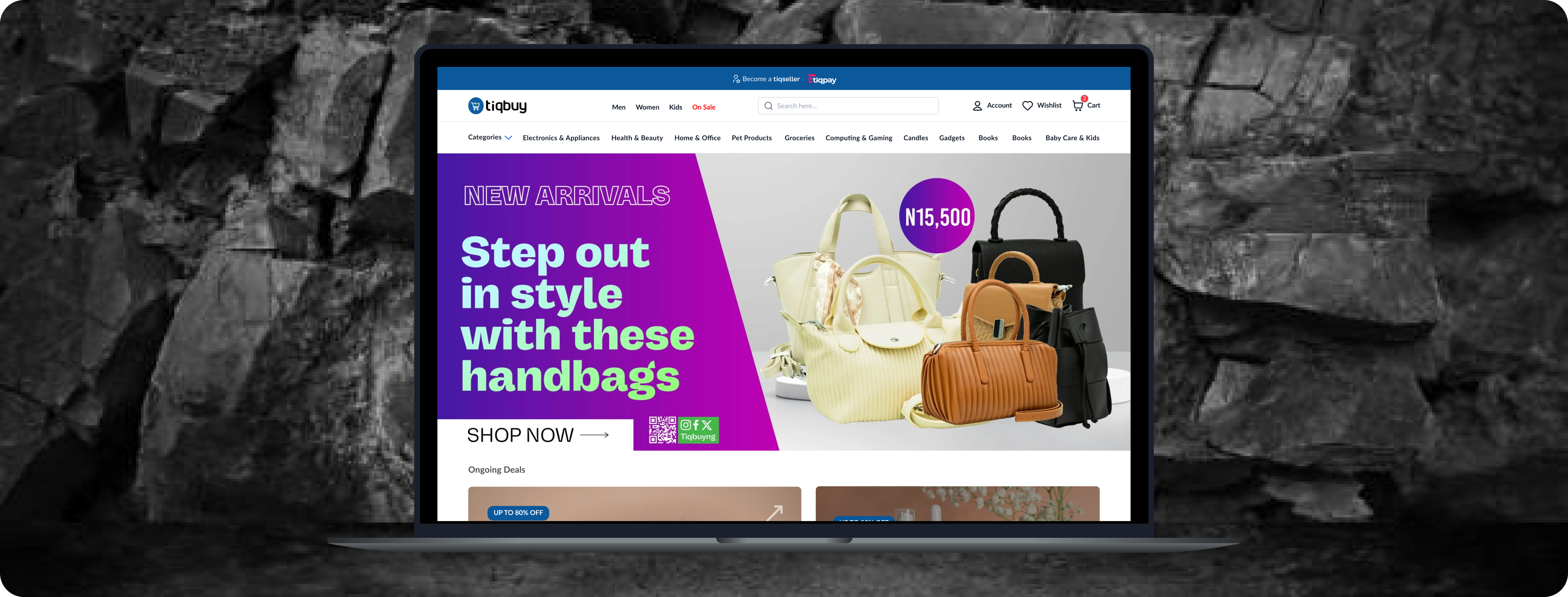
Tiqbuy, an e-commerce platform, facilities shopping for customers and allows retail like Colors A.K.A Fouani to sell their products.
TiqBuy
eCommerce
2023


RESEARCH + DESIGN PROCESS
Working with the design team, I redesigned our clients e-commerce website, applying industry best
practices
throughout the redesign process. We identified significant pain points in the e-commerce industry.
Through
rounds of meetings with stakeholders and industry research, we discovered issues, affecting conversion
rate
and overall customer satisfaction.
Our team also conducted an in-depth study of their current customer’s experiences using Hotjar to record
their present movements, existing site analytics, and an audit of their main competitors. Through the
audit,
we were able to determine what features needed to be replaced or added to remain competitive and capture
market space.
ANALYZING RESEARCH
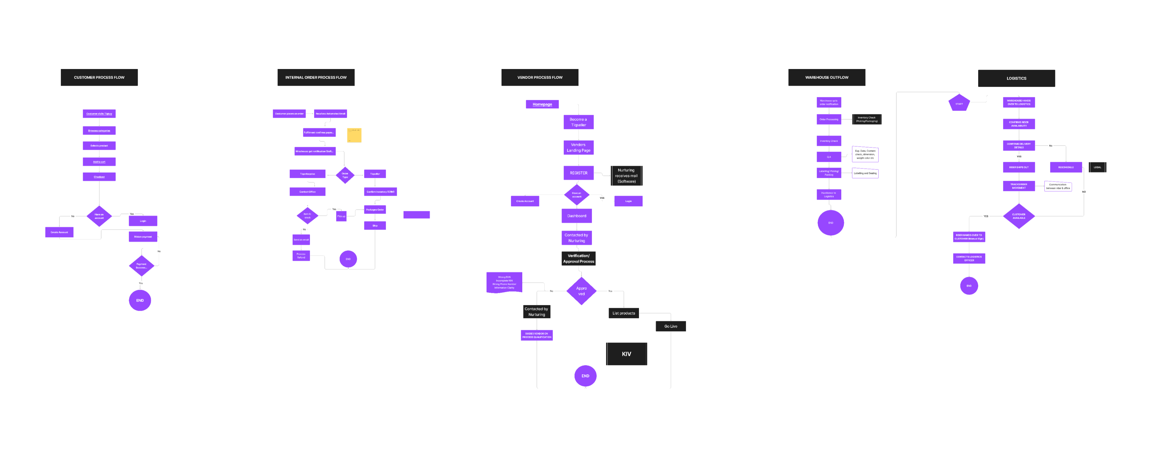
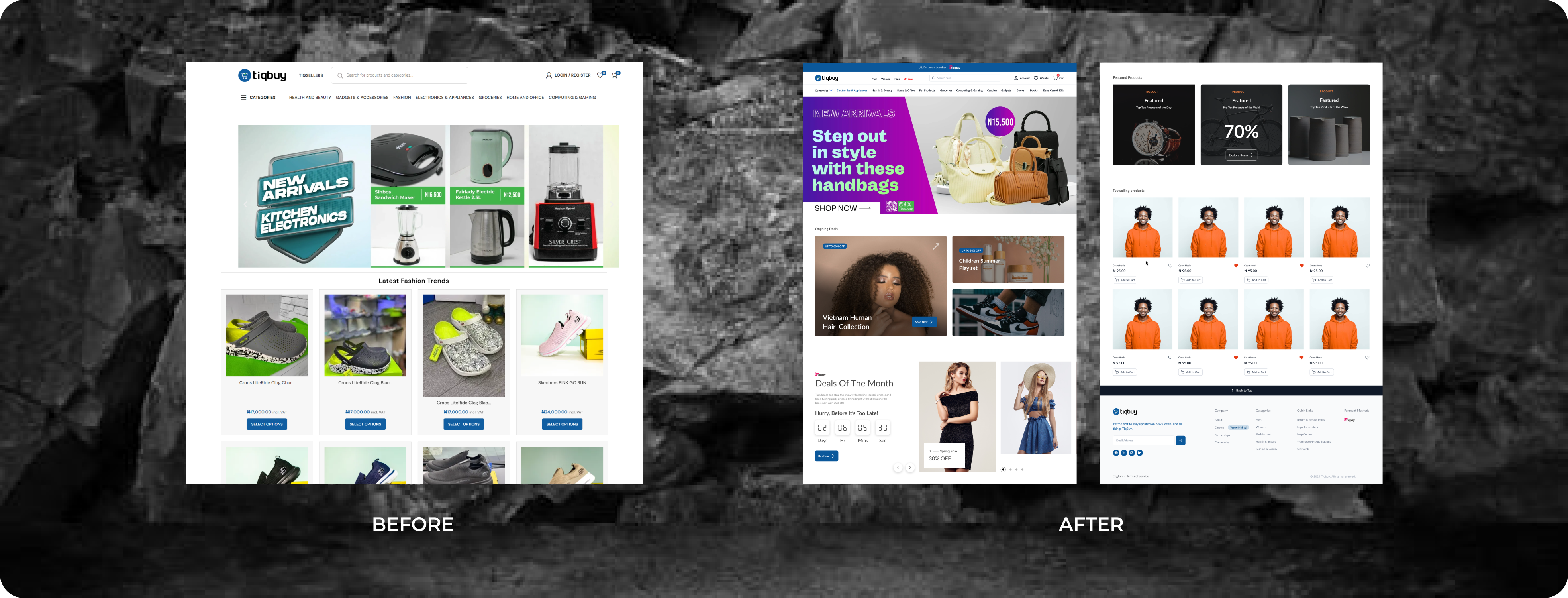
From our discovery phase analysis, we identified a significant opportunity to optimize several key areas of the website including the home page, primary navigation, checkout, category, and product pages to streamline the user experience.

PRIMARY NAVIGATION
By optimizing the main navigation, we reduced the number of clicks needed for customers to reach their
desired page from five to just two. The previous navigation structure was overly complex and required
users
to go through multiple layers to find the information or products they needed. With too many submenus
and
unclear categorization, customers had to click through five different steps before arriving at their
desired
page.
This cumbersome process not only increased the time and effort required to navigate but also led to
frustration and a poor user experience. Following best practices, we implemented an overlay category
design
that streamlined navigation, allowing users to go directly to their chosen product with ease.
PRODUCT PAGES
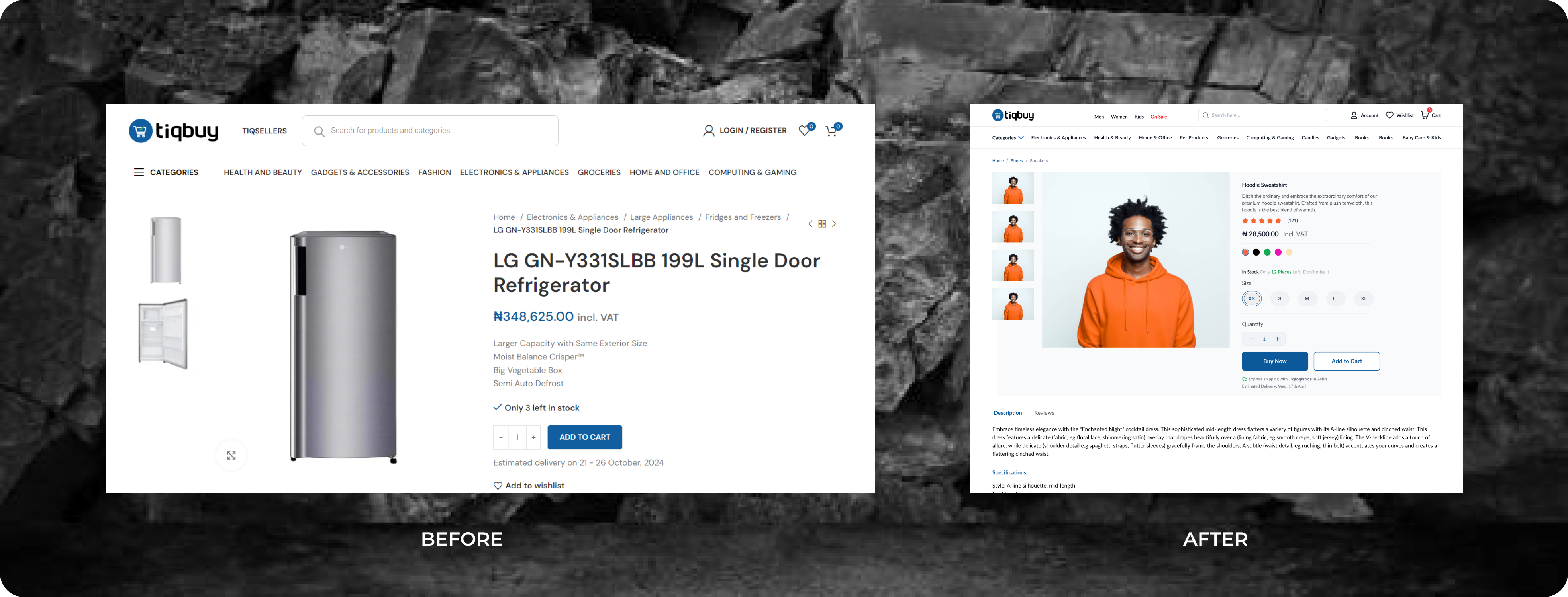
The product page faced several issues, making it challenging for users to easily select the right
product on
their own. Key problems included a lack of intuitive filters, unclear product descriptions, and a
confusing
layout that overwhelmed users with too many options at once. Additionally, the absence of visual cues or
guidance further hindered the selection process, leading to frustration and higher drop-off rates.
Users can now effortlessly connect products to their corresponding ingredient visuals, enhancing clarity
and
improving the decision-making process. We addressed this by enhancing the user’s ability to self-select
and
explore products through the addition of ingredient visuals alongside product names.
REVIEW + RATING
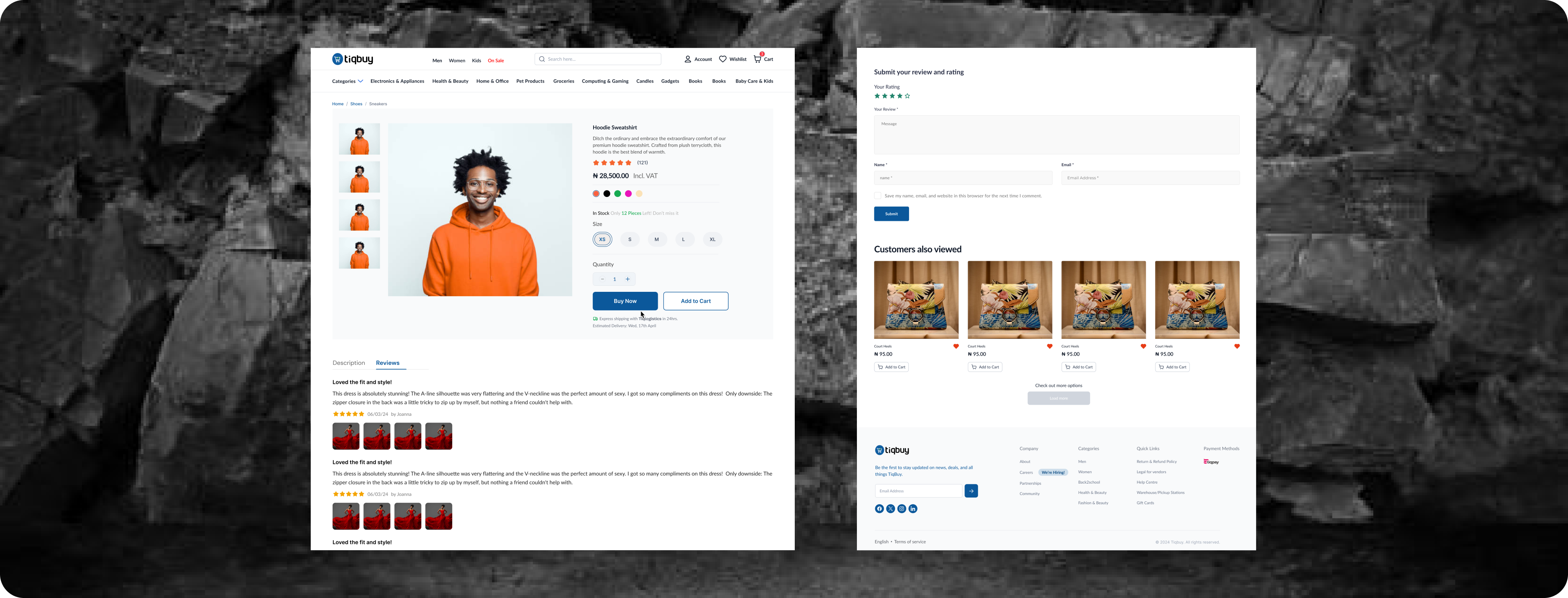
If customer reviews and ratings are buried or hard to find, users might not have easy access to social proof, leading to uncertainty in their decision-making. User reviews and ratings were emphasized with a clean layout, where customers get to see social proof and make more confident decisions.
RETURNS & ORDER
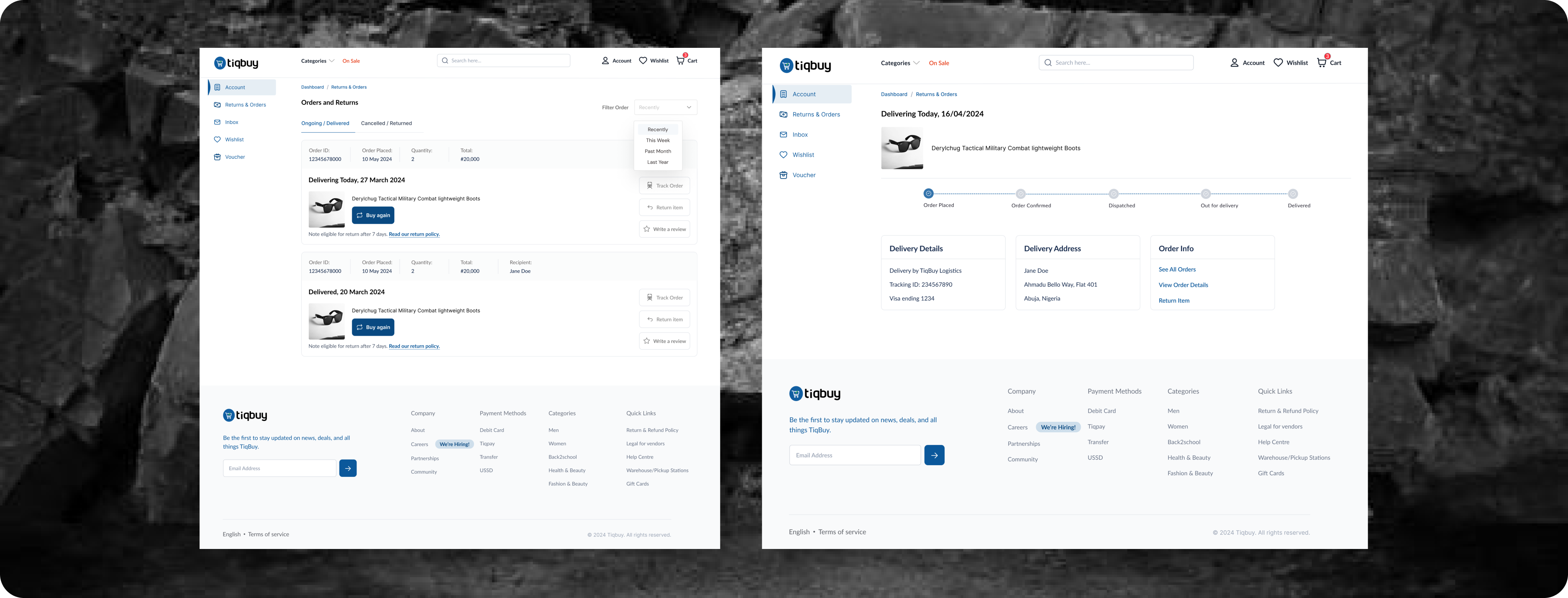
The returns and order feature wasn’t initially part of the first design but was introduced after further
insights into user pain points. During user research or post-launch feedback, it became clear that
customers
faced uncertainty or frustration with the returns process.
Some possible pain points identified were:
1. Lack of clarity on return policies or how to initiate a return.
2. Difficulty tracking order status.
3. Uncertainty about refund timelines or policies, discouraging users from competing purchase.
Based on this feedback, the design team brainstormed a way to simplify the returns process and make the
order
tracking feature more prominent. The team realized that simplifying these features would not only reduce
customer anxiety but also lead to higher conversion rates, as users would feel more confident completing
purchases.
FAQ's
Several decisions likely shaped the FAQ section, leveraging data from customer support queries, user
interviews, and reviews. We determine the most frequently asked questions. These included:
1. Product related questions
2. Shipping and returns information.
3. Payment options and warranty details.

MOBILE
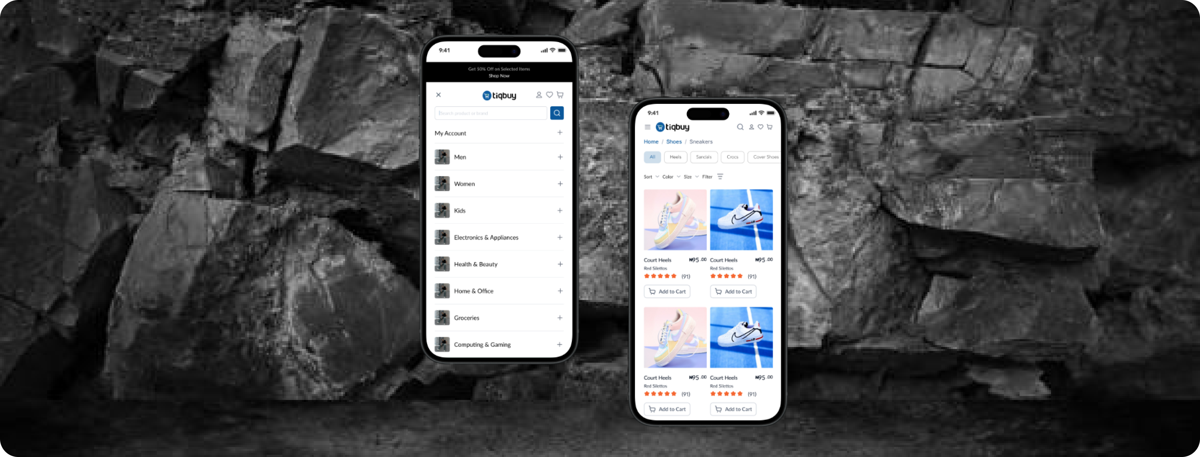
We adopted a mobile-first approach, ensuring that we not only optimized the mobile experience but also
addressed the pain points users encountered on the desktop version. Samplifying the product page, we
ensured
a seamless experience on mobile devices by:
* Prioritizing Key Information:
On mobile, screen space is limited, so we focused on displaying the most critical product details
upfront.
This included product images, price, and "Add to Cart" button. By prioritizing essential content, users
could quickly access the information they needed without unnecessary scrolling.
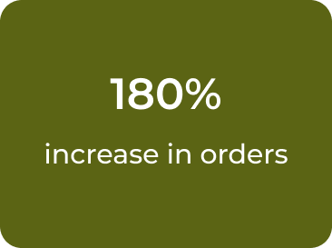
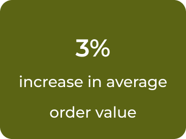
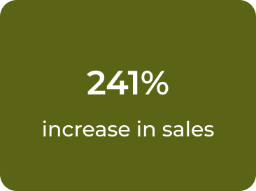
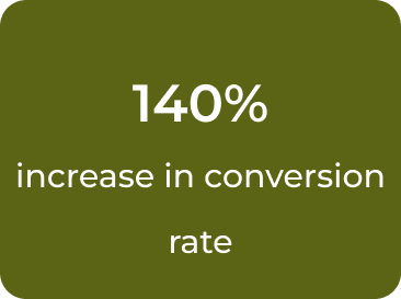
We reached our client's end overall goals within a month of launching.
1. Integrating established design elements from packaging and marketing onto the website to solidify the
brand's presence.
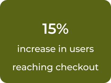
2. Creating seamless flows on products that helped increase checkout reach.
3. Statistics;
