
TripDoodler
Sustainable Travel Web Redesign
As lead product designer within the startup, I worked across information architecture, brand refresh, and responsive web design to help TripDoodler explain its value more clearly and support stronger conversion paths for the right audiences.
Context
TripDoodler
Industry
Travel
Clarifying What TripDoodler Offers
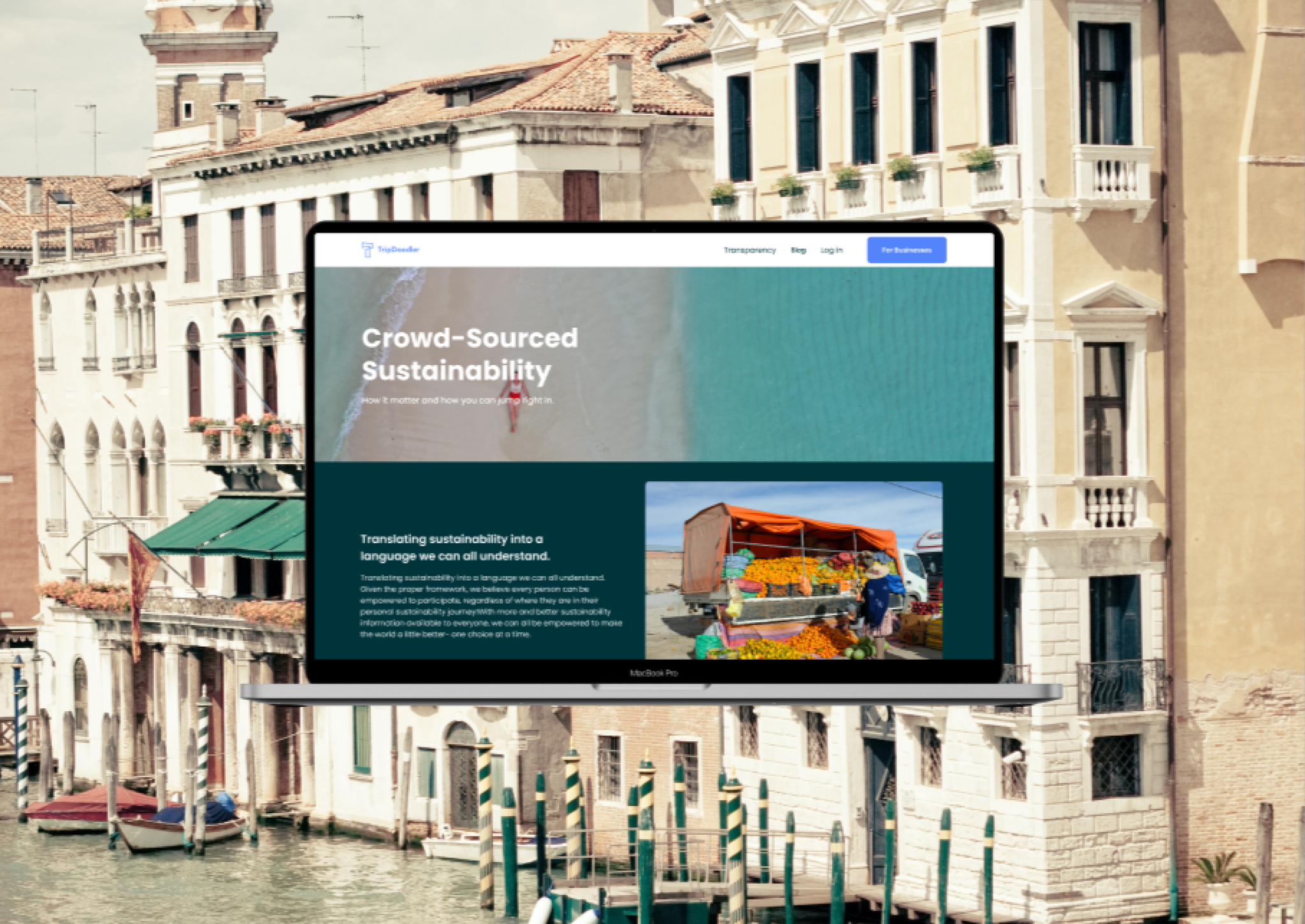
TripDoodler had a strong mission around sustainable travel, but the website was not clearly communicating what the product did, who it served, or how visitors should move through the experience.
Two of the biggest issues were non-qualified leads requesting a demo and general confusion around what TripDoodler actually did and how it worked. That made conversion quality just as important as conversion volume.
How Might We?
- Help visitors quickly understand what TripDoodler does and who it is for.
- Reduce non-qualified demo requests while improving the journey for self-serve users.
- Refresh the brand and website so the experience converts interest into clearer product intent.
Research
Covering The User Journey
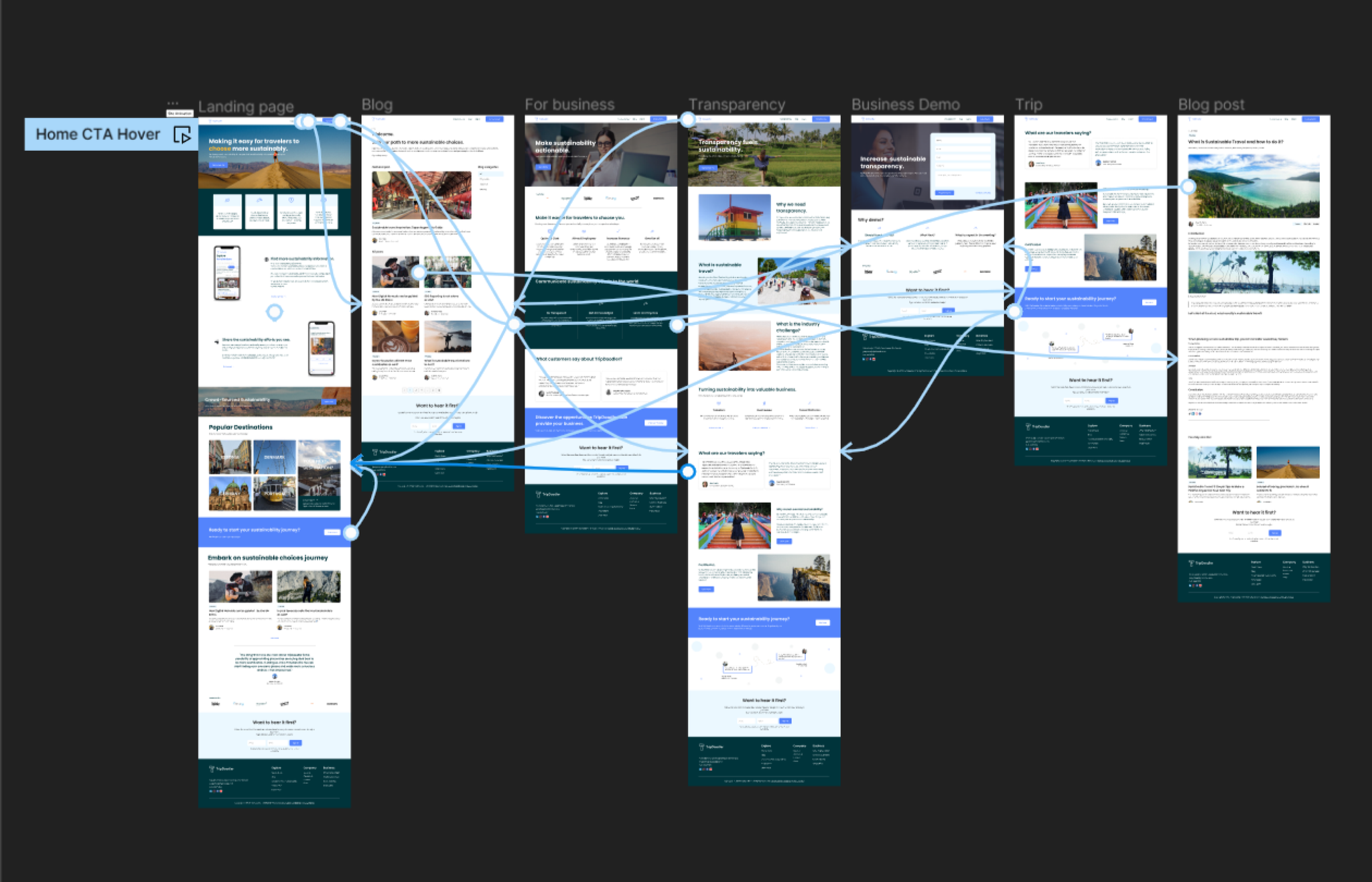
My first task was to improve the site architecture by synthesizing learnings, mapping the user journey, and developing clearer site specifications and a recommended sitemap.
I worked closely with the founding team to understand the platform's user personas, identify underserved audiences, and define which user types aligned most strongly with long-term revenue goals. That helped establish which journeys deserved more prominence in the new structure.
Pain Point
Non-qualified leads requesting a demo.
Pain Point
General confusion about what TripDoodler does and how.
Brand
Updating The Brand Identity
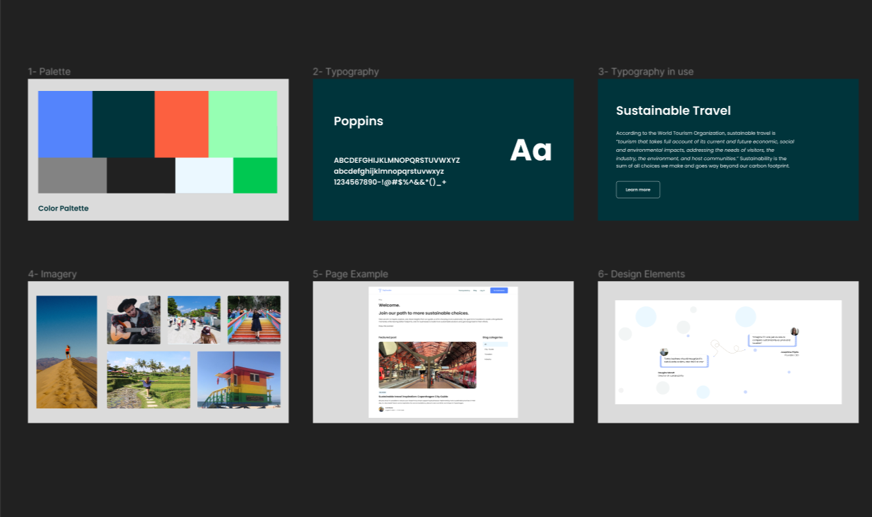
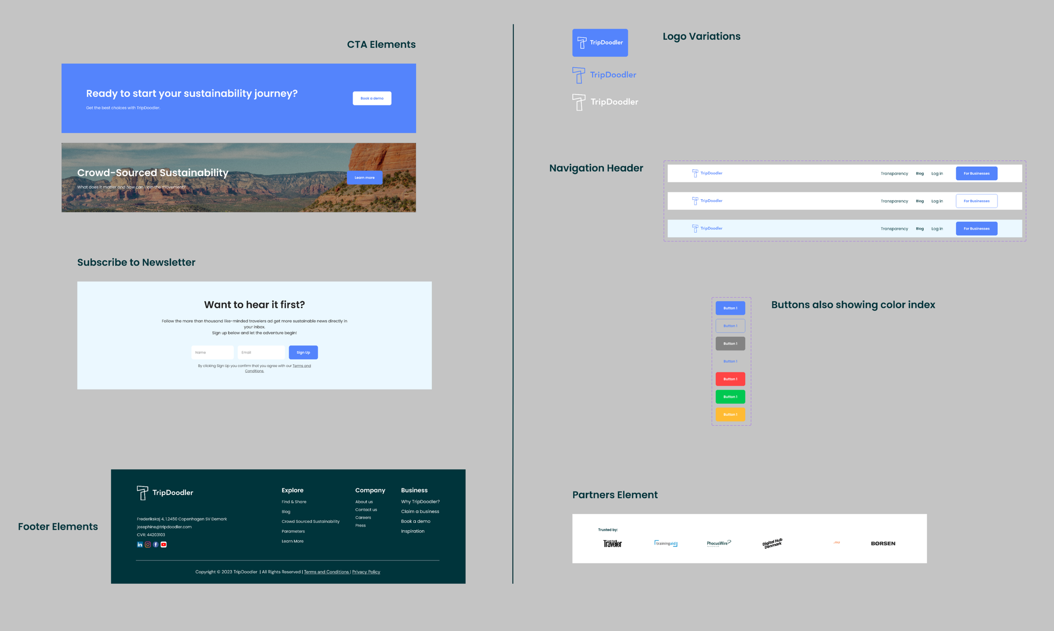
The next challenge was to refresh the brand while preserving the existing wordmark. The goal was to introduce a more modern visual language that could elevate TripDoodler across both the marketing website and the backend product.
I created three design concepts, refined the strongest directions with the team, and then built out a more comprehensive brand direction presentation with color, typography, and interface guidance.
After stakeholder review, I translated the approved direction into a detailed brand guidelines document in Figma so the updated identity could be implemented consistently across the product.
Design
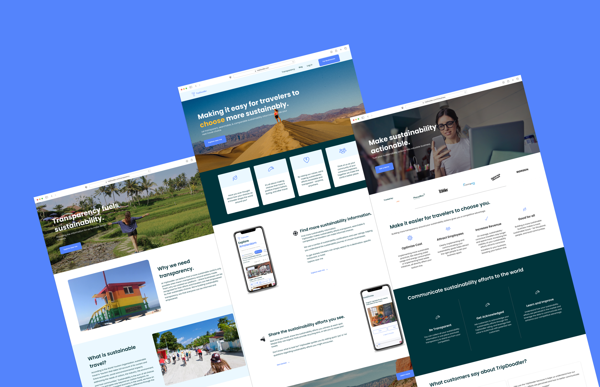
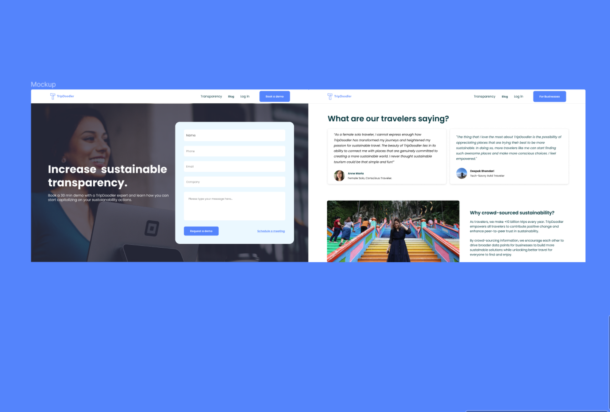
Reimagining The Web Experience
The final task was a complete overhaul of the web experience, designed screen by screen in Figma to support smoother collaboration across design, engineering, and stakeholders.
The site was optimized around conversion and lead capture by revisiting the information architecture, user personas, and the brand strategy work completed earlier in the process.
I also created prototypes for intended interactions and motion, then built a web design system with the colors, components, and states needed for implementation.
Sustainable detail pages replaced a single overview page, giving non-enterprise users a clearer and more actionable way to explore options.
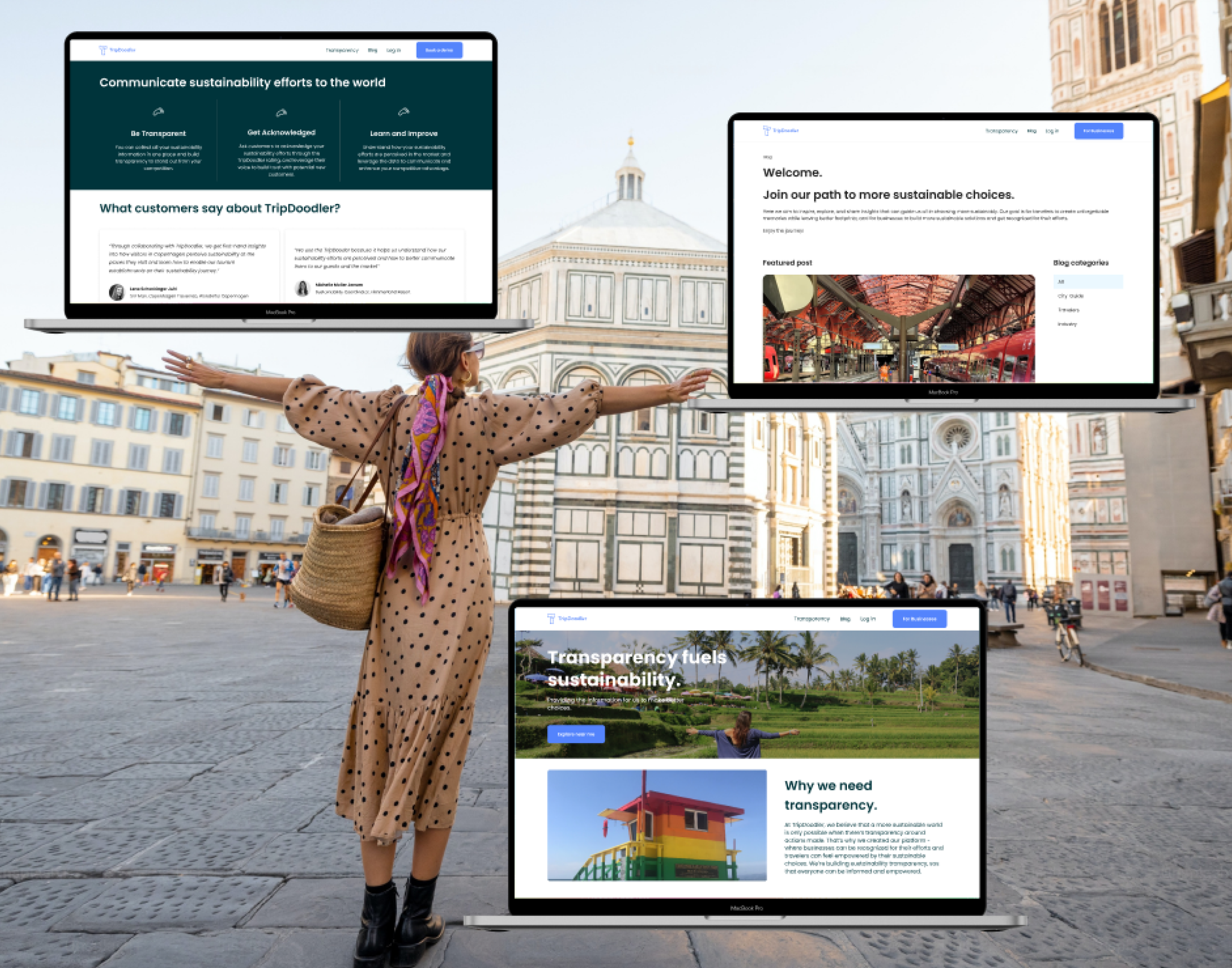
A dedicated Business path in the header helped TripDoodler communicate its broader sustainability offering to enterprise-minded visitors.
Right-side navigation was redesigned to better support log in, sign up, and profile access without sending users through fragmented subdomain flows.
Results
Clearer Journeys, Stronger Outcomes
The redesigned website made TripDoodler's mission and offer easier to understand while creating a more effective path from interest to qualified action.
Outcome
32%
Increase in travelers making sustainable choices.
Outcome
70%
Demo request lead accuracy.
Reflection
Designing Strategy Into The Website
TripDoodler's revamped website more clearly communicates its mission, methodology, and business value, helping turn visitors into better-fit leads while still serving a broader sustainability audience.
The project reinforced how closely brand clarity, product strategy, and information architecture need to work together when a marketing website is also doing the job of product education.
Previous
Next